CLIENT: Coach
PROJECT: Coach Poppy Collection Minisite
ROLE: Senior Art Director
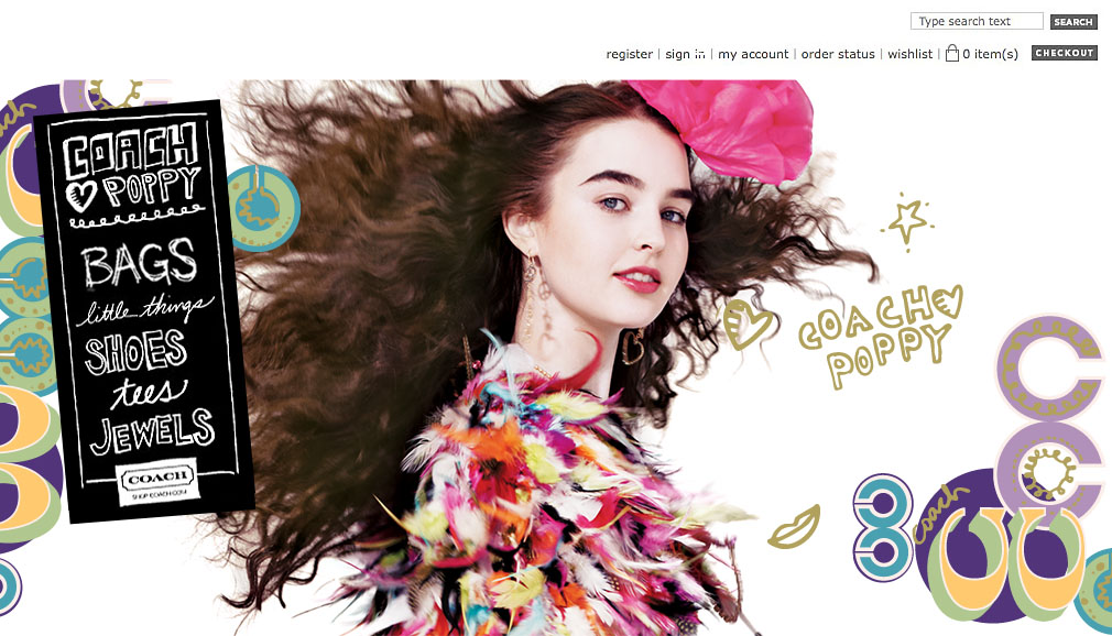
Coach launched a new collection called “Poppy” aimed at a younger or young-at-heart audience. We created a separate mini-site (within the regular coach.com site) to really give the collection its own identity.


Homepage
For the Poppy Collection, we created a separate homepage, or mini site. It was accessible off the main homepage, or from direct links, online ads or social media. We used a hand drawn navigation bar and images from the Poppy campaign, or video.
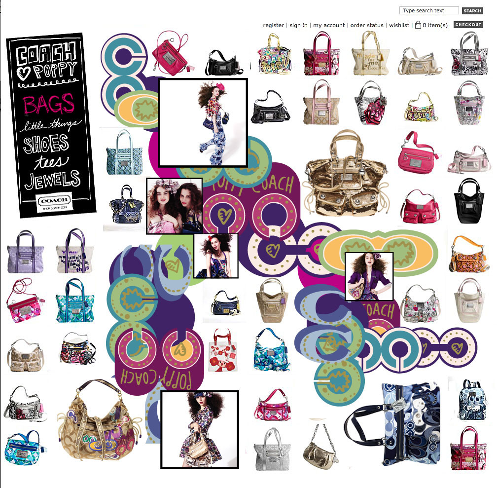
Category Page
We wanted the category pages to be more dynamic than typical grid ones. So we incorporated the Poppy “C” pattern along with fashion images from the campaign. Then the handbags could be dynamically poplated around the editorial content.
